
[WPF] Xaml에서의 템플릿 사용 가이드
업데이트:
WPF 템플릿 사용 가이드
WPF의 Template
WPF의 템플릿이란 무엇인가?
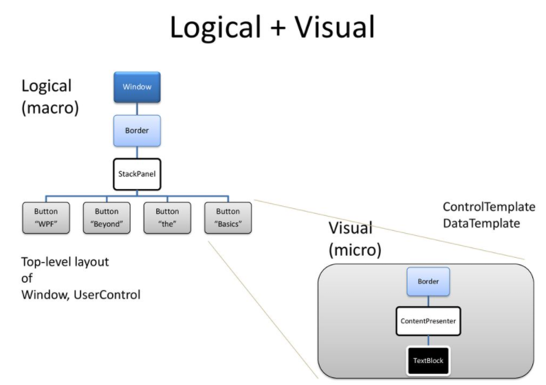
간단하게 말하면 WPF Control의 틀이라고 보면 된다. WPF의 모든 컨트롤 요소들은 Control을 통해 UI/UX가 정의된다.
더 자세히 보면 템플릿은 부모 자식 관계를 갖는 엘리먼트들을 생성시킬 수 있는 정의. 즉 루트 엘리먼트, 자식 엘리먼트 등 각각의 엘리먼트의 속성에 무엇이 있는지 선언하는 것입니다.
WPF에서 사용중인 Button, Label 등 컨트롤들은 XAML을 통해 인스턴스가 생성되며 템플릿을 정의하지 않아도 이미 정의되어있다. 템플릿을 정의한다는 것은 이미 정의된 템플릿을 새로 정의한다는 의미이다.
Template 종류와 Presenter
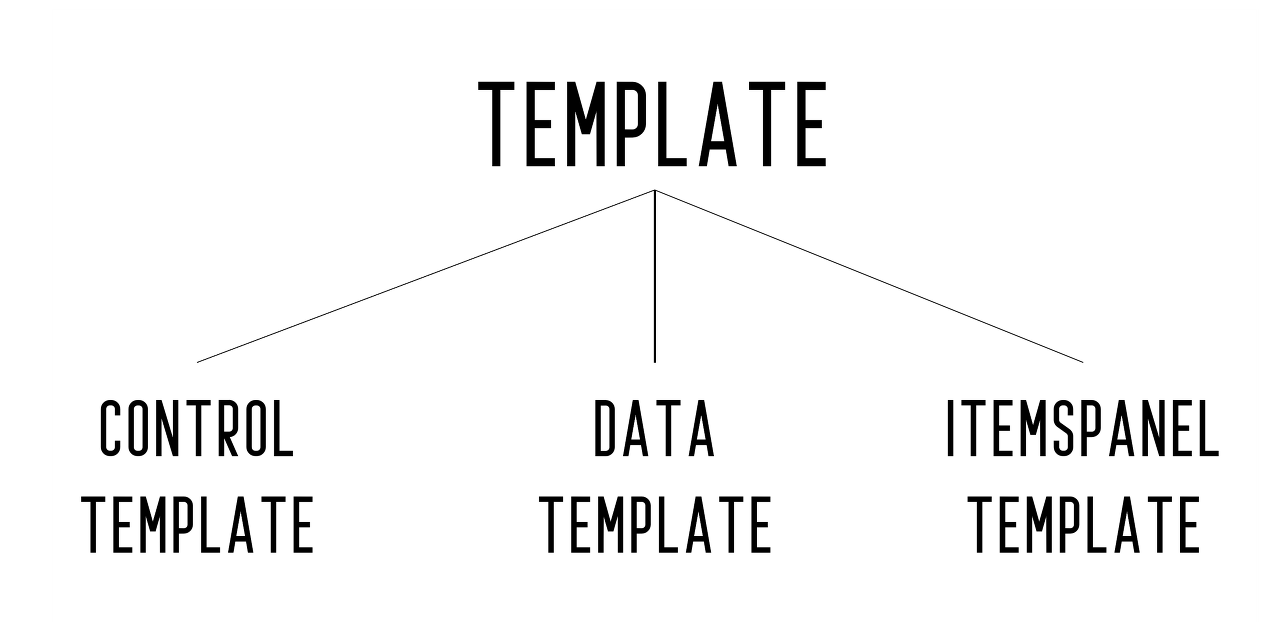
Template의 종류에는 다음과 같이 있다.
- ControlTemplate: 컨트롤에 표현될 UI의 형태를 정의
- DataTemplate: 컨트롤에 표현될 데이터의 형태를 정의
- ItemsPanelTemplate: ComboBox, ListBox 등 하위 Items들을 갖는 컨트롤의 레이아웃을 정의
그리고 ControlTemplate을 정의하고 이것을 배치하기위한 Presenter가 존재한다. Presenter는 컨텐츠를 표시하는 역할을 한다.
아래와 이미지와 같이 Presenter는 콘텐츠에 단순한 컨트롤이나 다양한 타입의 객체들에 대한 처리를 담당한다.
Presenter의 종류에는 다음과 같다.
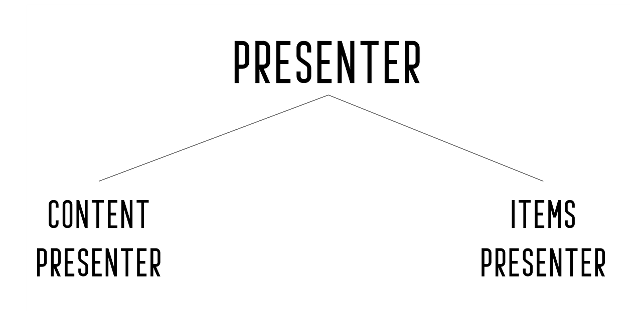
즉, 정리하면 컨트롤을 ControlTemplate으로 정의한 후 Presenter로 입력될 Contents의 배치와 내용을 정의한다.
여기서 ContentPresenter는 일반 Content의 배치와 내용을 정의하고, ItemsPresenter는 ComboBox, ListBox 등 하위 Items의 배치와 내용을 정의한다.
아래는 각 템플릿과 컨트롤간 사용할 수 있는 요소에 대한 연관관계를 나타낸다.
| ControlTemplate | DataTemplate | ItemsPanelTemplate | |
|---|---|---|---|
| Control | Control.Template | X | X |
| ContentControl | ContentControl.Template, ContentPresenter | ContentControl.ContentTemplate | X |
| ItemsControl | ItemsControl.Template, ItemsPresenter | ItemsControl.ItemTemplate | ItemsControl.ItemsPanel |
ControlTemplate
다음은 ControlTemplate이다. ControlTemplate는 컨트롤에 표현될 UI의 형태를 정의 라고 명시하였다.
ControlTemplate 사용의 한 예시다.
Button의 Template 요소를 찾아 ControlTemplate을 정의한다. 그리고 ContentPresenter를 통해 표시될 콘텐츠에 대한 처리를 한다.
<Window x:Class="TemplateSample.MainWindow"
        xmlns="http://schemas.microsoft.com/winfx/2006/xaml/presentation"
        xmlns:x="http://schemas.microsoft.com/winfx/2006/xaml"
        xmlns:d="http://schemas.microsoft.com/expression/blend/2008"
        xmlns:mc="http://schemas.openxmlformats.org/markup-compatibility/2006"
        xmlns:local="clr-namespace:TemplateSample"
        mc:Ignorable="d"
        Title="MainWindow" Height="450" Width="800">
    <Grid>
        <Button Content="버튼"
                Width="100"
                Height="100">
            <Button.Template>
                <ControlTemplate TargetType="Button">
                    <Grid>
                        <Ellipse Width="100"
                                 Height="100"
                                 Name="redInnerCircle">
                            <Ellipse.Fill>
                                <SolidColorBrush Color="Red"></SolidColorBrush>
                            </Ellipse.Fill>
                        </Ellipse>
                        <ContentPresenter HorizontalAlignment="Center"
                                          VerticalAlignment="Center" />
                    </Grid>
                    <ControlTemplate.Triggers>
                        <Trigger Property="IsMouseOver"
                                 Value="True">
                            <Setter TargetName="redInnerCircle"
                                    Property="Fill"
                                    Value="lightblue"></Setter>
                            <Setter TargetName="redInnerCircle"
                                    Property="Cursor"
                                    Value="Hand"></Setter>
                        </Trigger>
                    </ControlTemplate.Triggers>
                </ControlTemplate>
            </Button.Template>
        </Button>
    </Grid>
</Window>
여기서 ComboBox나 ListView 등 하위 Items을 갖고있는 컨트롤의 경우 ItemsPresenter를 활용할 수 있다.
 <ListView ItemsSource="{Binding Colors}">
    <ListView.Template>
        <ControlTemplate TargetType="{x:Type ListView}">
            <ItemsPresenter Margin="2,0,0,0"/>
        </ControlTemplate>
    </ListView.Template>
</ListView>
DataTemplate
다음은 DataTemplate이다.
DataTemplate는 위에서 컨트롤에 표현될 데이터의 형태를 정의 라고 명시하였다.
즉 ComboBox나 ListView 같은 ItemsControl 내의 각 Item ContentControl의 ContentTemplate 속성에 정의되는 Template이 바로 DataTemplate이다.
DataTemplate 사용의 한 예시다.
ListView의 ItemTemplate 요소를 찾아 DataTemplate을 정의한다.
<Window x:Class="TemplateSample.MainWindow"
        xmlns="http://schemas.microsoft.com/winfx/2006/xaml/presentation"
        xmlns:x="http://schemas.microsoft.com/winfx/2006/xaml"
        xmlns:d="http://schemas.microsoft.com/expression/blend/2008"
        xmlns:mc="http://schemas.openxmlformats.org/markup-compatibility/2006"
        xmlns:local="clr-namespace:TemplateSample"
        mc:Ignorable="d"
        Title="MainWindow" Height="450" Width="800">
    <Grid>
        <ListView ItemsSource="{Binding students}">
            <ListView.ItemTemplate>
                <DataTemplate DataType="local:Student">
                    <StackPanel Orientation="Vertical" Width="130" Height="60">
                        <TextBlock Text="{Binding Name}" Margin="0 0 10 0"/>
                        <Button Width="90" Height="20">
                            <Button.Template>
                                <ControlTemplate>
                                    <Border x:Name="btnBorder" BorderBrush="Blue" BorderThickness="1">
                                        <Grid Background="Black">
                                            <ContentPresenter>
                                                <ContentPresenter.Content>
                                                    <TextBlock>
                                                            <Run Text="{Binding Name}"/>
                                                            <Run Text=" 지우기"/>
                                                    </TextBlock>
                                                </ContentPresenter.Content>
                                            </ContentPresenter>
                                        </Grid>
                                    </Border>
                                    <ControlTemplate.Triggers>
                                        <Trigger Property="IsMouseOver" Value="true">
                                            <Setter TargetName="btnBorder" Property="BorderBrush" Value="Red"/>
                                        </Trigger>
                                    </ControlTemplate.Triggers>
                                </ControlTemplate>
                            </Button.Template>
                        </Button>
                    </StackPanel>
                </DataTemplate>
            </ListView.ItemTemplate>
        </ListView>
    </Grid>
</Window>
ItemsPanelTemplate
다음은 ItemsPanelTemplate이다.
ItemsPanelTemplate는 위에서 ComboBox, ListBox 등 하위 Items들을 갖는 컨트롤의 레이아웃을 정의 라고 명시하였다.
즉 ComboBox나 ListView 같은 ItemsControl의 ItemsPanel 속성에 정의되는 Template이 바로 ItemsPanelTemplate이다.
ItemsPanelTemplate 사용의 한 예시다.
ListView의 ItemsPanel 요소를 찾아 ItemsPanelTemplate을 정의한다.
<Window x:Class="TemplateSample.MainWindow"
        xmlns="http://schemas.microsoft.com/winfx/2006/xaml/presentation"
        xmlns:x="http://schemas.microsoft.com/winfx/2006/xaml"
        xmlns:d="http://schemas.microsoft.com/expression/blend/2008"
        xmlns:mc="http://schemas.openxmlformats.org/markup-compatibility/2006"
        xmlns:local="clr-namespace:TemplateSample"
        mc:Ignorable="d"
        Title="MainWindow" Height="450" Width="800">
    <Grid>
        <ListView ItemsSource="{Binding students}">
            <ListBox.ItemsPanel>
                <ItemsPanelTemplate>
                    <WrapPanel Margin="0 10 10 0"/>
                </ItemsPanelTemplate>
            </ListBox.ItemsPanel>
            <ListView.ItemTemplate>
                <DataTemplate DataType="local:Student">
                    <StackPanel Orientation="Vertical" Width="130" Height="60">
                        <TextBlock Text="{Binding Name}" Margin="0 0 10 0"/>
                        <Button Width="90" Height="20">
                            <Button.Template>
                                <ControlTemplate>
                                    <Border x:Name="btnBorder" BorderBrush="Blue" BorderThickness="1">
                                        <Grid Background="Black">
                                            <ContentPresenter>
                                                <ContentPresenter.Content>
                                                    <TextBlock>
                                                            <Run Text="{Binding Name}"/>
                                                            <Run Text=" 지우기"/>
                                                    </TextBlock>
                                                </ContentPresenter.Content>
                                            </ContentPresenter>
                                        </Grid>
                                    </Border>
                                    <ControlTemplate.Triggers>
                                        <Trigger Property="IsMouseOver" Value="true">
                                            <Setter TargetName="btnBorder" Property="BorderBrush" Value="Red"/>
                                        </Trigger>
                                    </ControlTemplate.Triggers>
                                </ControlTemplate>
                            </Button.Template>
                        </Button>
                    </StackPanel>
                </DataTemplate>
            </ListView.ItemTemplate>
        </ListView>
    </Grid>
</Window>
Binding 활용
WPF 템플릿에서 데이터를 표현할 때 Binding을 자주 사용하게 된다. 여기서 Binding 표현식에는 여러 방식이 있다.
| ElementName | 명시적으로 Name을 가진 엘리먼트 |
|---|---|
| Source | VisualTree에 없는 리소스나 비 UI 엘리먼트 참조 |
| RelativeSource | 자신의 위치부터 상대적인 위치에 있는 부모나 동료 참조 |
| X | 암시적으로 DataContext를 참조하며, 상위로 올라가면서 참조 |
템플릿의 경우는 직접 정의할 경우, 보통 상대적 참조와 암시적 참조가 가능한 RelativeSource와 비워두는 방식을 많이 사용한다.
특히 DataTemplate에서는 데이터 전달이 DataContext를 통해 많이 이루어지기 때문에 비워두는 방식을 사용하는 것이 일반적이다.
TemplateBinding 이라는 놈도 있다.
이 바인딩 방식은 Template을 설정한 부모의 속성값을 가져온다. 다음과 같은 방식으로 쓰이며 RelativeSource와 두 가지 동작은 같은 표현이지만 ControlTemplate을 위해 더욱 최적화되고 가볍게 만들어졌기 때문에 TemplateBinding 사용이 권장된다.
<Border Background="{TemplateBinding Background}"/>
<Border Background="{Binding RelativeSource={RelativeSource TemplatedParent}}"/>
정리
WPF의 템플릿에 대해 알아보았다.
알고 있었던 내용이지만, 템플릿을 다루는 부분은 매번 개발을 할 때 마다 헷갈릴 때가 많기 때문에 이 포스팅으로 정리하게 되었다.
사실 개발이란게 그런 것 같다.
정말 잘 아는 내용이라도 조금만 안보면 금새 까먹고 다시 찾아봐야 하는 경우가 잦다. 그럴 때 마다 이러한 포스팅 작업들은 개발 도중 참고용으로도 활용 가능하지만, 직접 고민하고 공부하며 작성해서인지 더욱 기억에 남는 것 같다.
그러다보니 자기개발과 동시에 업무 효율성도 증가되는 선순환 효과가 정말 소중한 성과인듯 하다.
이번에 다룬 템플릿 내용도 머릿속에 오래 남아 활용할 수 있기를 바래본다.
댓글남기기